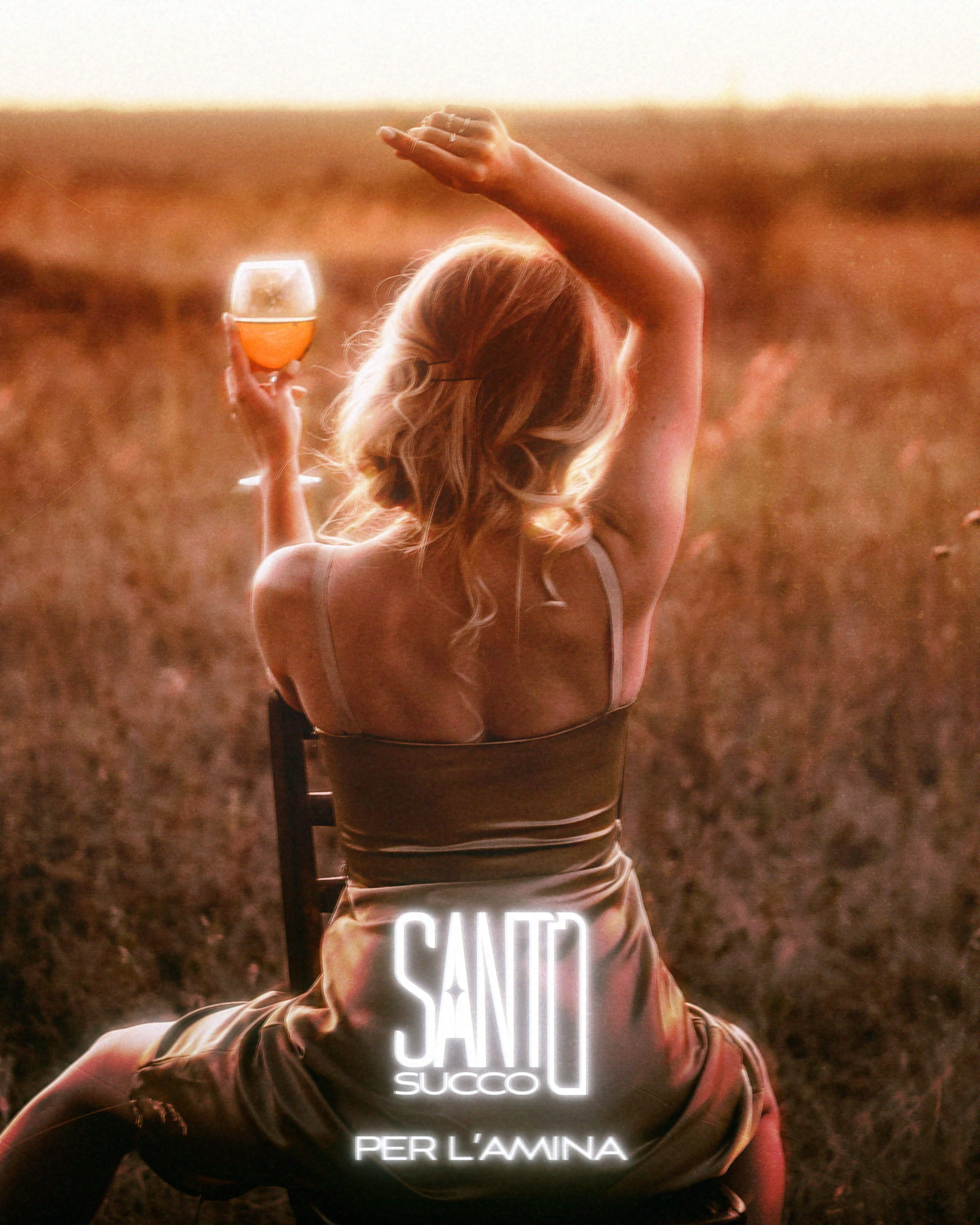
Santo Succo is a branding concept project that I created....in Italian. Why? Because my 700 day odd duolingo streak gave me way too much self confidence in my linguistic abilities.
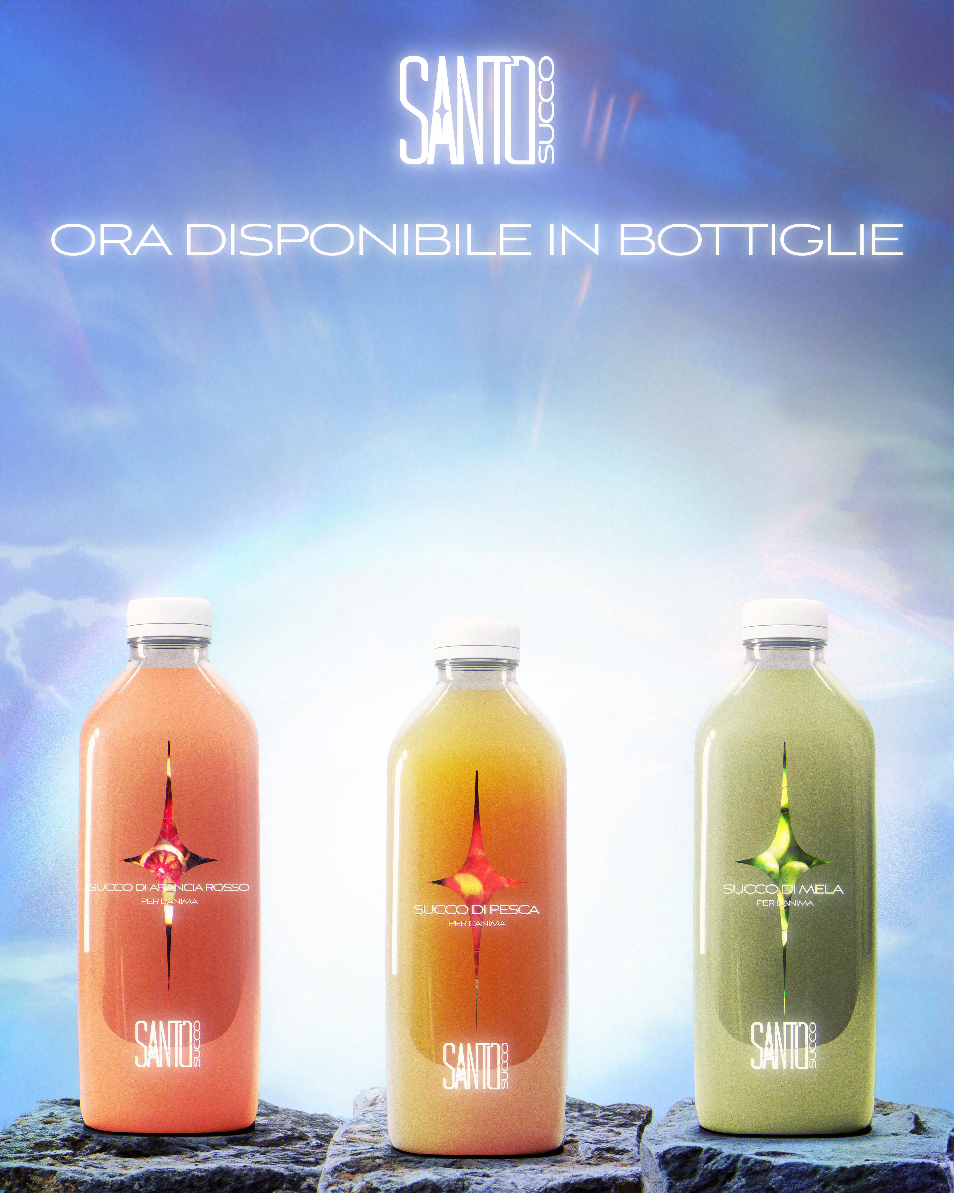
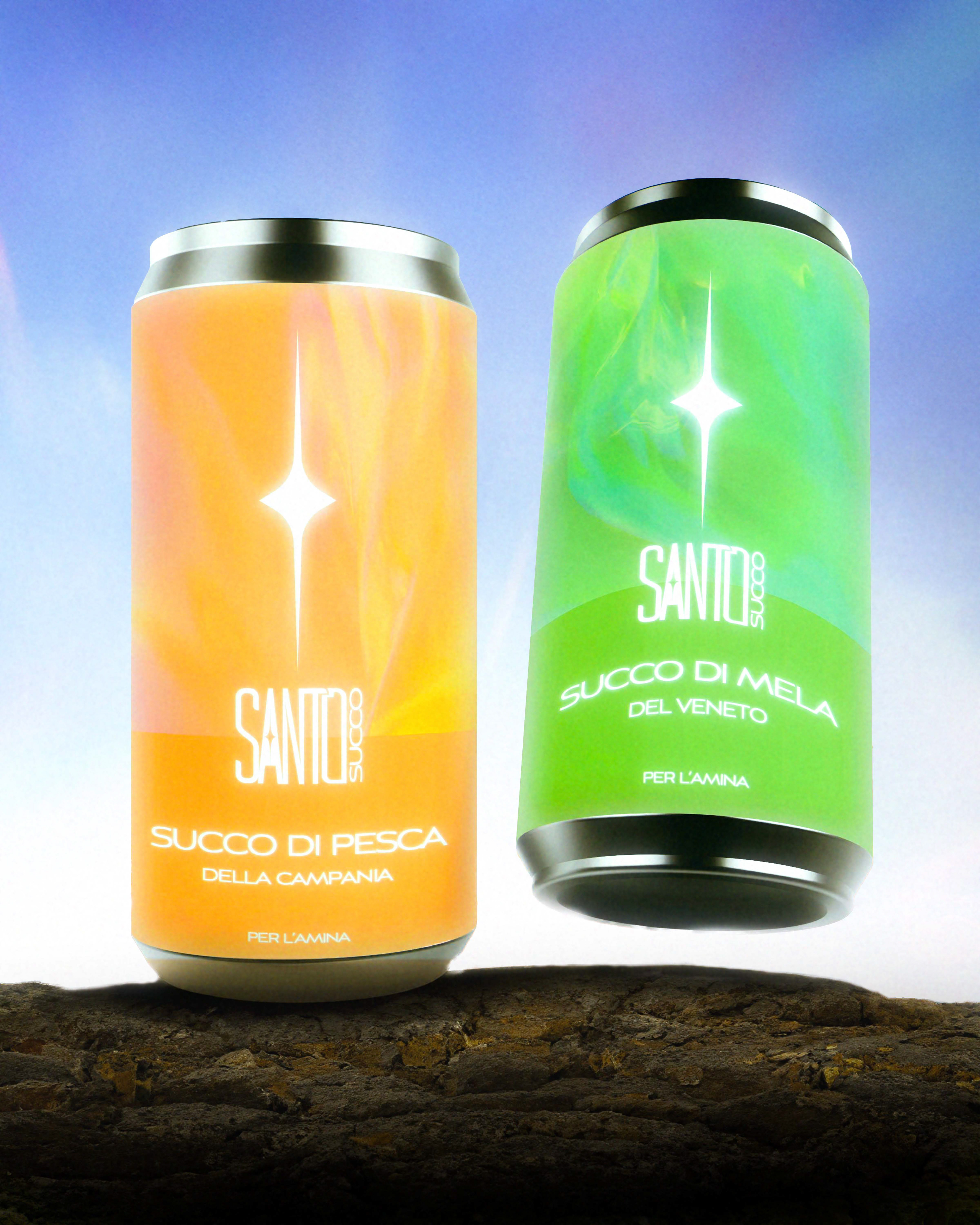
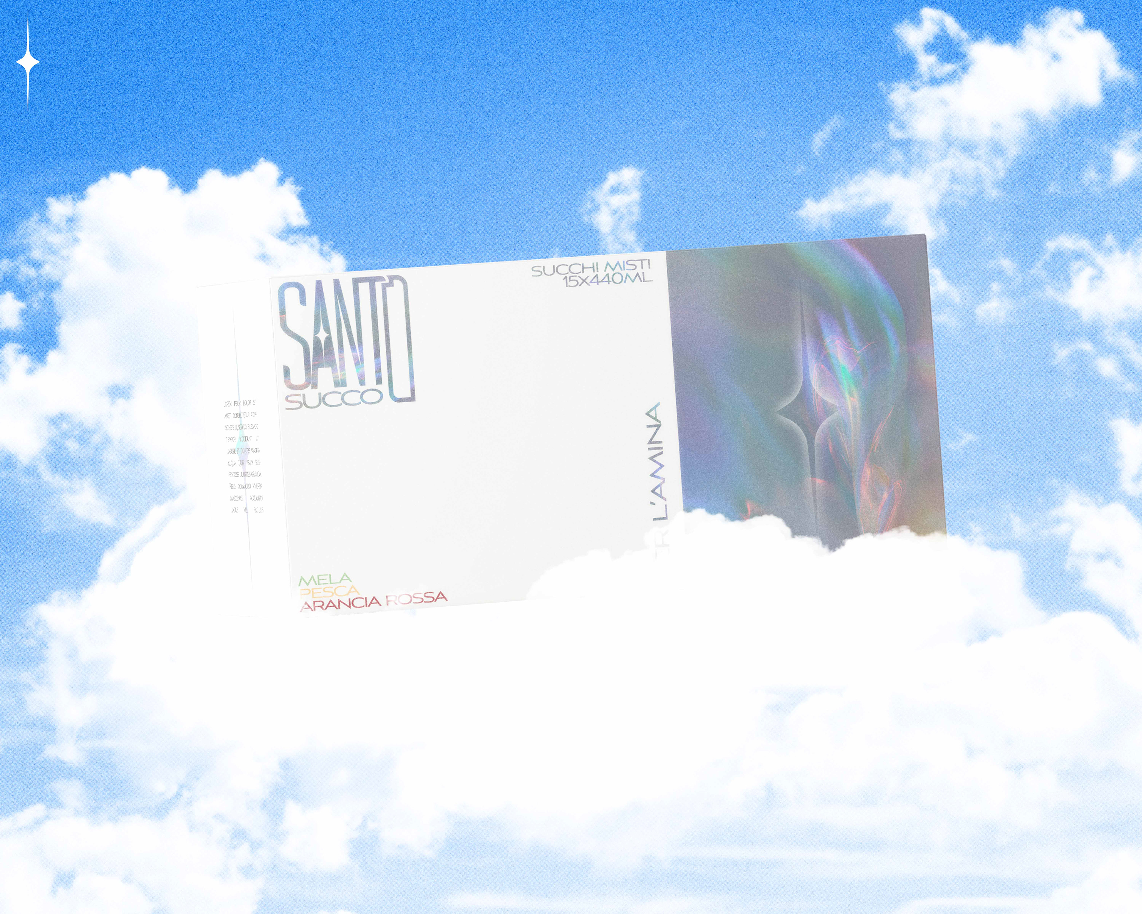
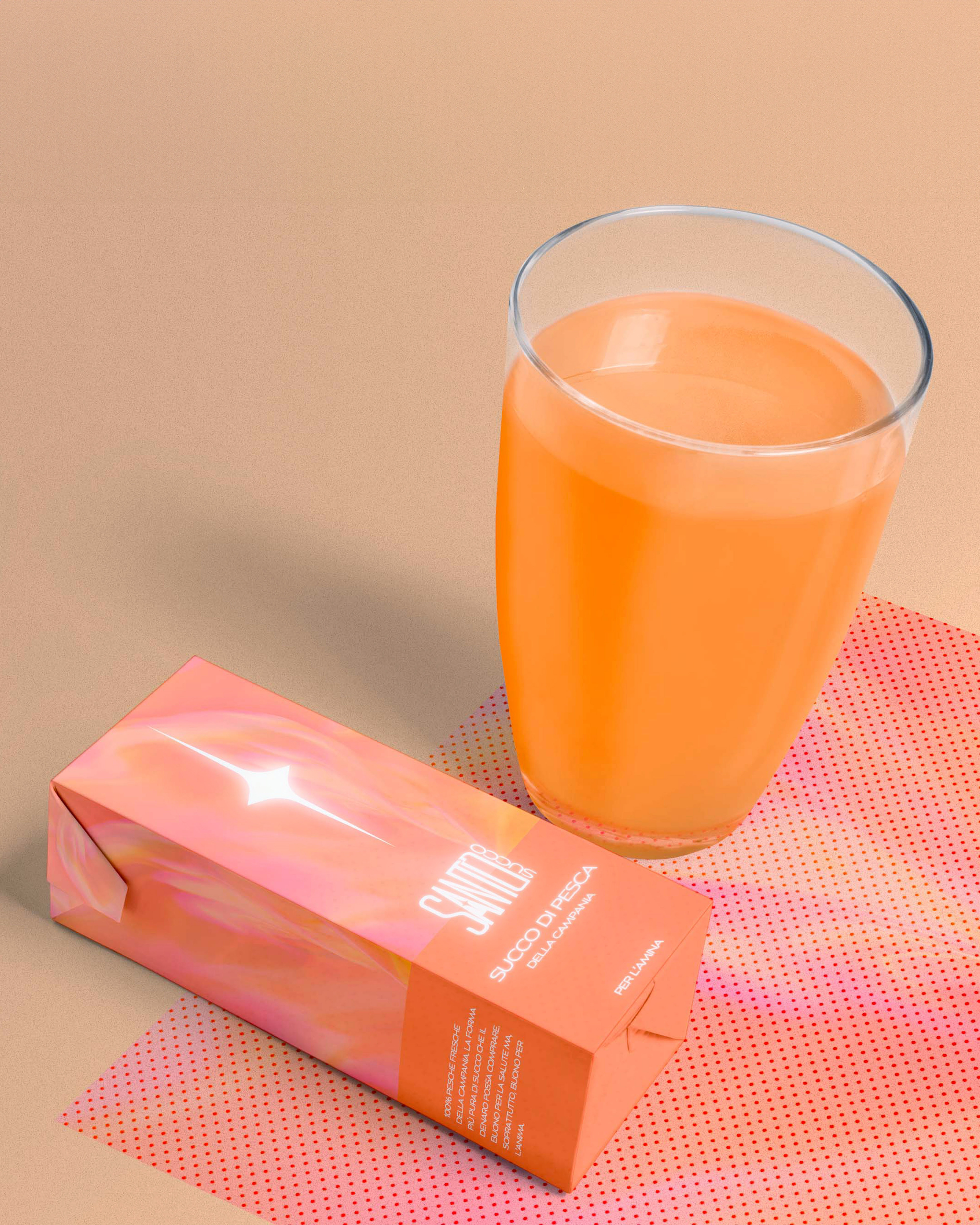
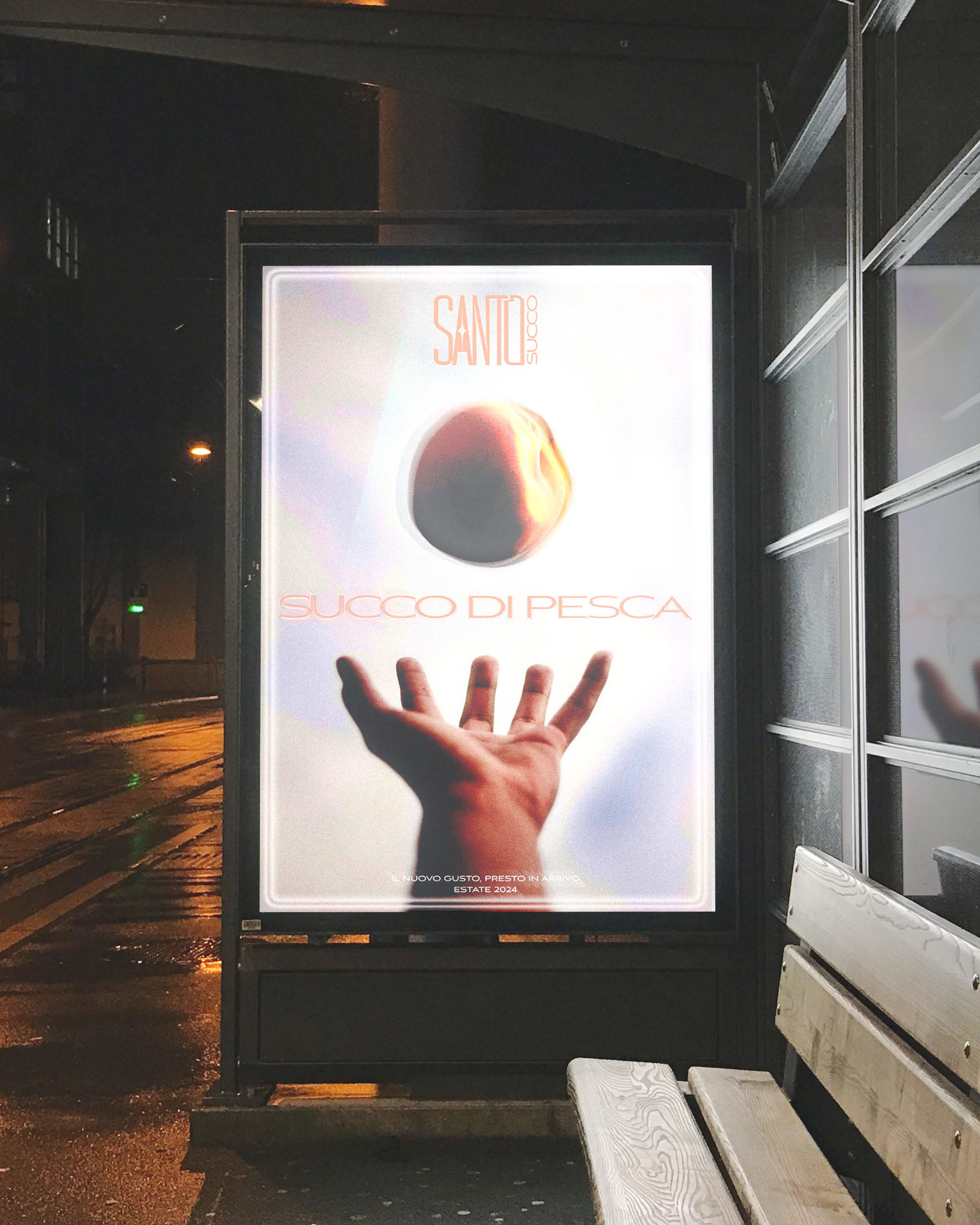
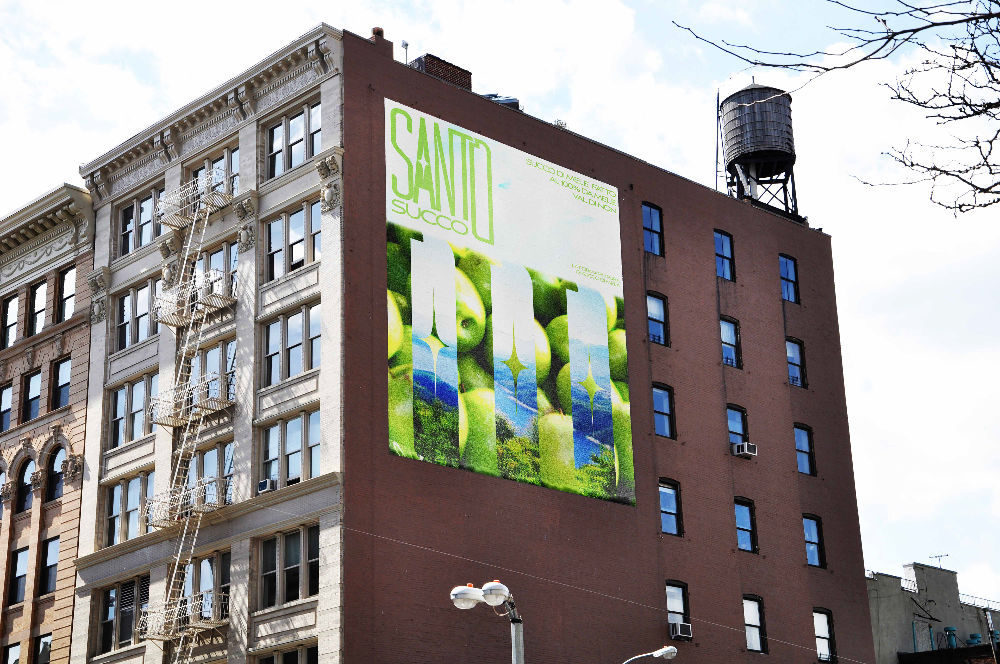
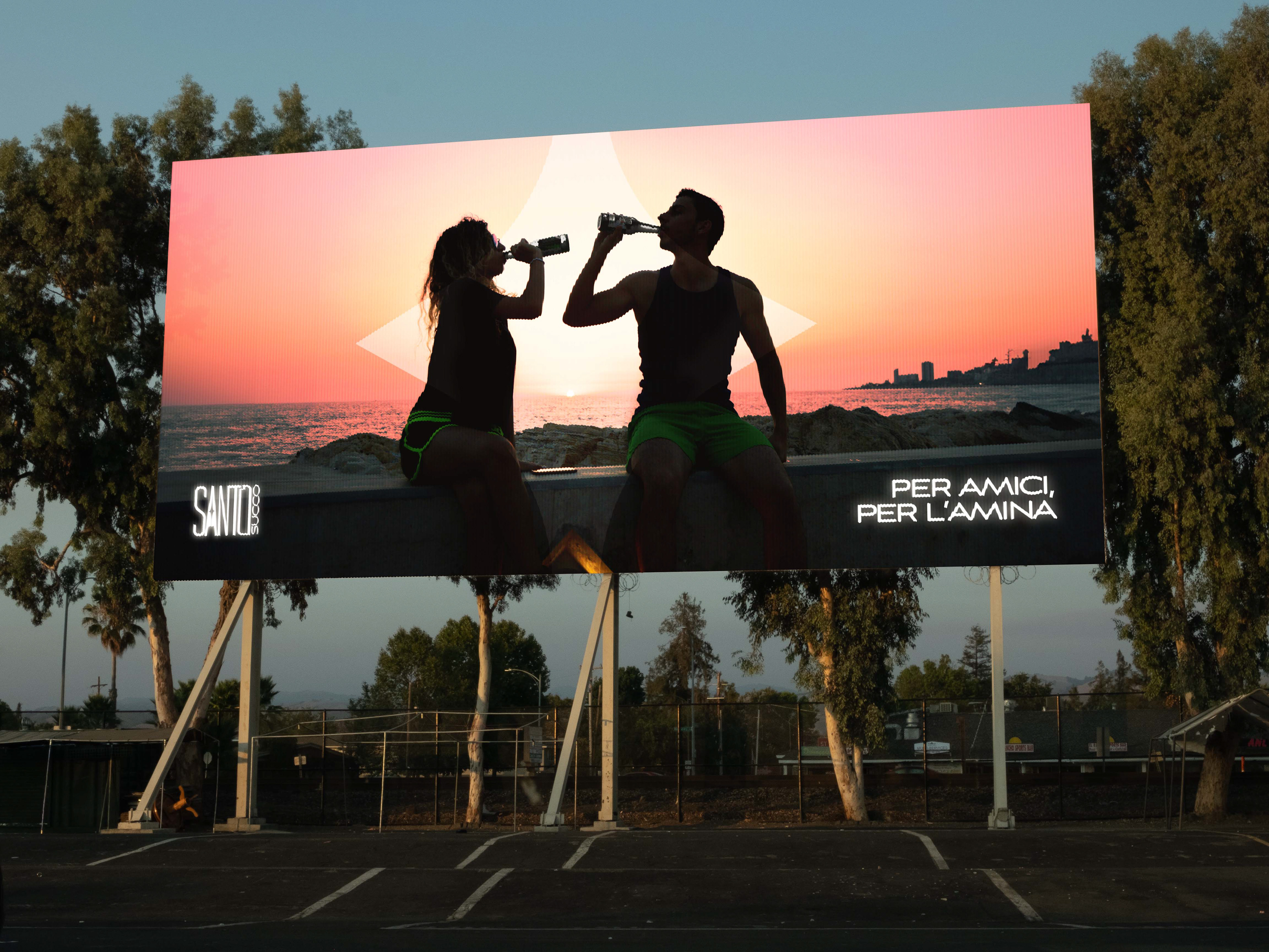
The goal for this project was really to play around with different form factors when it came to packaging design, being able to create a seamless cohesion throughout that emphasises the brand.
Regarding the brand, santo succo translates to 'holy juice' (which doesn't sound quite as cool in plain ol' english), so for the visual identity I wanted to focus on creating an ethereal, radiant and minimal aesthetic.
Spero che ti piaccia.